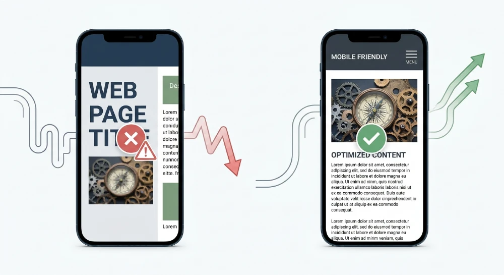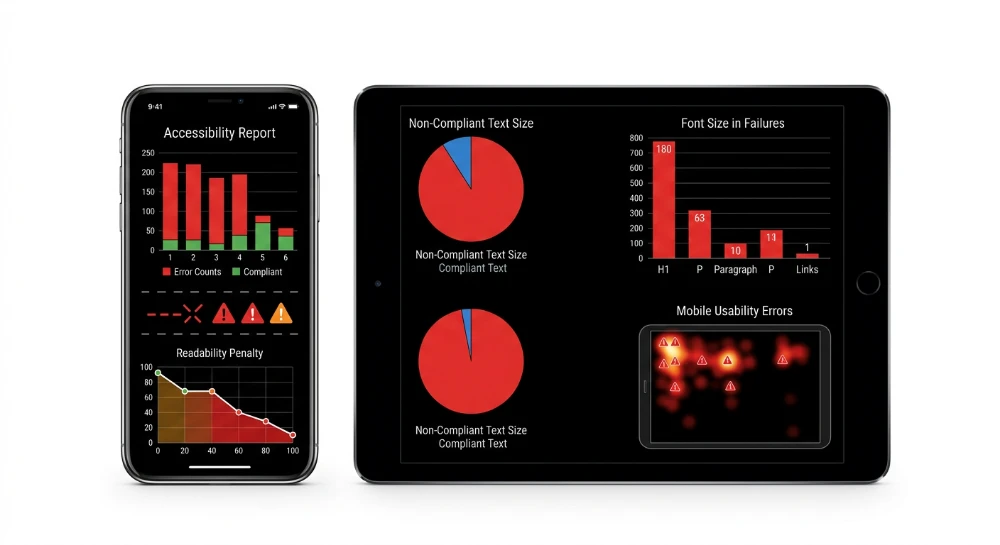
Understanding why sizing of a touch target causes mobile usability console errors requires analyzing the Google Search Console Mobile Usability report. The system flags a URL with the Clickable elements too close together status when interactive HTML elements render within overlapping interference zones. Googlebot simulates viewport rendering at 320 pixels wide to evaluate the physical distance between navigation links, buttons, and form fields. Elements lacking sufficient padding trigger this exact compliance failure.
Inadequate spacing generates fat-finger errors on mobile devices. Users trigger unintended actions on touchscreens. A mistap on an adjacent checkout button directly increases the mobile bounce rate while event tracking records immediate conversion drop-offs when navigation elements overlap in the document object model without minimum margin properties.
Interface engineering relies on strict dimensional baselines to clear search engine validation parameters. The following accessibility standards dictate compliant hit areas for touchscreen interaction.
- Google Material Design requires 48x48 density-independent pixels for all primary touch interfaces.
- WCAG 2.5.8 Target Size Minimum enforces a 24x24 CSS pixel boundary offset by calculated margin space.
- WCAG 2.5.5 Target Size Enhanced demands 44x44 CSS pixels for standalone interactive components.
Failing these specific parameters restricts a page from achieving optimal SERP visibility. Proper CMS templates must implement strict box model adjustments to maintain SEO performance and prevent interaction failures.
Diagnosing mobile usability errors in Google search console
Access the Mobile Usability report under the Experience section in GSC. This dashboard aggregates rendering failures detected by smartphone crawlers. Isolate the Clickable elements too close together and Text too small to read error flags immediately. These two warnings frequently trigger simultaneously. A missing base font size or unscaled typographic hierarchy cascades directly into touch target collapse.
Do not attempt to fix pages individually. GSC data requires macro-level analysis to map isolated errors back to root structural flaws. Extract the affected URL clusters to identify systemic template failures.
- Export the complete list of failing pages into a raw spreadsheet format.
- Sort the dataset by directory path to isolate common subdirectories and routing patterns.
- Match the failed URL clusters against your CMS architecture to pinpoint the exact offending component causing the overlap.
GSC relies on historical crawl data. The dashboard often displays errors that engineering teams resolved days prior. You need real-time verification before initiating a formal validation request. Cross-reference the flagged clusters against Google Lighthouse Mobile-Friendly test API metrics. Querying the API returns immediate diagnostic feedback based on current live HTML parameters rather than stale index data.
| Diagnostic Source | Data Latency | Execution Method | Primary Application |
|---|---|---|---|
| GSC Mobile Usability | High | Passive crawler aggregation | Template pattern identification |
| Lighthouse API | Zero | Active viewport simulation | Pre-validation verification |
Submitting a validation request in GSC initiates a specific recrawl queue. The process is not instantaneous. Googlebot prioritizes validation crawls based on site authority and historical crawl budget utilization.
The system transitions the error status to Pending while spiders process the submitted URL clusters. This indexing delay often spans two to three weeks. If a single page within the sample cluster fails the viewport rendering check during this period, the entire validation batch fails. Executing real-time API tests against the highest-traffic pages in your cluster prevents this sequential delay by ensuring absolute compliance before alerting the search engine to re-evaluate the domain.
Run a deep technical crawl to identify 4xx errors, missing meta tags, and indexation blockers.
Platform guidelines and accessibility minimums for hit areas
Reconciling mobile usability standards requires understanding the discrete measurement units used by different operating systems and web accessibility consortiums. Web rendering engines operate on CSS pixels. This absolute digital unit differs fundamentally from hardware-based metrics. Device-Independent Pixels scale according to physical screen density to maintain consistent dimensions across varying Android displays. Apple utilizes points for iOS application development, functioning identically to Device-Independent Pixels. Mapping native OS guidelines to web standards forces engineering teams to synthesize these disparate units into unified CSS pixel boundaries.
Measurement architecture and Cross-Platform baselines
You must align Google Material Design constraints with Apple Human Interface Guidelines and WCAG criteria to guarantee interface compliance across all devices.
| Framework Standard | Dimension Requirement | Base Measurement Unit | Implementation Logic |
|---|---|---|---|
| Google Material Design | 48x48 | Device-Independent Pixels | Primary touch target baseline for Android |
| Apple Human Interface Guidelines | 44x44 | Points | iOS minimum hit area requirement |
| WCAG 2.5.5 Target Size Enhanced | 44x44 | CSS pixels | Strict accessibility compliance threshold |
| WCAG 2.5.8 Target Size Minimum | 24x24 | CSS pixels | Absolute floor requiring mandatory clearance margins |
Translating 48x48 density-independent pixels into a responsive web layout translates directly to 48x48 CSS pixels under standard viewport scaling. WCAG 2.5.5 Target Size Enhanced sets a rigorous accessibility threshold at 44x44 CSS pixels. WCAG 2.5.8 Target Size Minimum permits a severely reduced 24x24 CSS pixel boundary, provided sufficient spacing exists around the element to prevent interaction conflict. Standardizing global interface components on 48x48 CSS pixels clears all algorithmic validation checks and accessibility thresholds simultaneously.
Interaction physics and fitts' law
Hit area optimization relies heavily on Fitts' Law. This predictive human-computer interaction model dictates that the time required to rapidly move to a target area is a function of the ratio between the distance to the target and the width of the target itself. Smaller interface elements demand higher user precision. High precision execution on mobile touchscreens drastically increases interaction time and cognitive friction.
When interface elements shrink below the 44x44 CSS pixel threshold, error rates compound rapidly. The physical surface area of an average adult fingertip spans roughly 10 to 14 millimeters. Mapping this biological dimension to digital screens necessitates the 48x48 baseline to accommodate natural variance in touch pressure, approach angle, and device posture. Smaller targets force the user to slow down, disrupting task momentum and degrading the interaction flow.
Resolving touch friction topologies
Suboptimal hit area configurations manifest as specific usability failure patterns in production environments. You must diagnose and engineer solutions for these exact touch interaction failure models.
- Interference errors trigger when two distinct active elements share overlapping touch zones. The mobile browser cannot deterministically resolve the user intent, resulting in the execution of the wrong script or hyperlink.
- Accidental taps occur frequently during vertical scrolling operations. Elements lacking adequate horizontal or vertical margin capture touch events intended for viewport panning, instantly derailing the user journey.
- Mistaps represent direct user intent that fails to register. The finger lands immediately outside the computed CSS bounding box of the element. Resolving this requires expanding the transparent clickable area beyond the visible icon or text layer.
- Dead zone optimization involves strategically structuring inert space around high-risk elements. Padding out the non-interactive space between a primary submit action and a destructive cancel action absorbs imprecise physical interactions without firing catastrophic application states.
Mitigating these interaction patterns prevents behavioral metric degradation. High mistap rates directly inflate session abandonment. Users rarely attempt a failed tap more than twice before terminating the session entirely. Correctly scaling targets neutralizes this interface friction before it registers as a bounce in your analytics pipeline.
CSS box model configuration for touch target expansion
Manipulating the CSS box model is the foundational engineering step for hit area expansion. You scale the computed Clickable Area without triggering visual bloat or disrupting layout constraints. Transparent interaction boundaries must extend far beyond the visible borders of the graphic or text node. The underlying mechanics rely on how the browser rendering engine calculates element geometry.
Enforcing structural integrity with Border-Box
Standard box model behaviors utilize additive dimensions. Adding padding to increase a touch target expands the total rendered footprint. This shatters grid alignments and forces unwanted reflows. Implement the box-sizing property mapped to border-box on all interactive elements.
This directive completely alters the dimension calculation formula. The layout engine absorbs the added padding inside the explicit width and height boundaries. The structural integrity of the container remains intact. You expand the internal transparent touch zone exactly where the user taps. Visual boundaries remain static.
.touch-optimized-element {
  box-sizing: border-box;
}
Scaling clickable zones through padding and minimum dimensions
Hardcoding fixed pixel heights creates critical accessibility failures. Text scaling operations will overflow fixed containers. Rely exclusively on min-height and min-width properties. Setting a 44px minimum dimension guarantees the element meets strict accessibility baseline thresholds while allowing organic vertical expansion if the content requires it.
Combine these dimensional minimums with strategic padding allocations. Hit-area padding inflates the invisible touch boundaries around the core content node. The user physical interaction intersects the empty space, and the browser registers the tap perfectly. This is how you prevent Mistaps without enlarging font sizes or icons to absurd proportions.
- Assign min-height parameters to establish an absolute minimum vertical interaction boundary.
- Assign min-width parameters to prevent narrow inline elements from failing horizontal tap heuristics.
- Distribute internal padding values to inflate the transparent touch surface symmetrically around the text node.
- Remove fixed height declarations to ensure text wrap algorithms do not clip content during viewport scaling.
Engineering inert space with margin and flexbox spacing
Padding defines tap acceptance. Margins define the dead space. You must configure these properties simultaneously. A massive target area fails if it directly collides with an adjacent element bounding box. You need rigid, non-collapsing unclickable zones between targets.
Modern layout architecture standardizes this through Flexbox models. Standard block layouts suffer from unpredictable collapsing margin behaviors. Wrapping element clusters in containers set to display: flex or display: inline-flex eliminates these rendering anomalies.
Standard inline HTML elements ignore vertical margin assignments completely. Converting a standard text link to inline-flex forces the browser engine to respect vertical spacing constraints. You can then map specific alignments using the gap property. The gap attribute enforces absolute, non-collapsing inert space between child elements in the flex container.
| CSS Attribute | Box Model Function | Touch Target Mechanics |
|---|---|---|
| Padding | Internal spatial inflation | Expands the active touch-responsive surface without scaling graphics. |
| Min-height | Vertical dimension threshold | Guarantees baseline accessibility compliance while permitting text scaling. |
| Margin | External spatial displacement | Creates unpredictable dead zones due to standard collapsing margin rules. |
| Gap | Flexbox spatial enforcement | Generates rigid, mathematically exact dead zones between interactive nodes. |
| Inline-flex | Display rendering logic | Forces inline elements to strictly obey horizontal and vertical dimension inputs. |
Integrating the gap property into navigational wrappers instantly resolves dense cluster collisions. You define the exact pixel distance necessary to separate touch zones. The browser calculates the required inert space automatically, drastically reducing the interference error rates across the entire application interface.
SEO structure and reciprocal link analyzer
Detect orphan pages, deep click depths, and toxic reciprocal links built by careless agencies.
Engineering accessible hit areas for High-Density UI elements
Dense interface architecture inevitably forces interaction surfaces into conflict. When designers refuse to increase the visible dimensions of micro-components to meet strict spacing requirements, you must decouple the visual rendering boundary from the interactive hit boundary. You accomplish this by deploying CSS pseudo-elements to generate transparent, oversized interactive layers that overlap the visual component.
Using the ::before or ::after pseudo-elements allows you to project an invisible bounding box out from the center of any small element. The visual aesthetics remain completely untouched. The browser engine recognizes the expanded transparent region as part of the parent trigger. Tap accuracy stabilizes instantly.
.micro-trigger {
  position: relative;
}
.micro-trigger::after {
  content: "";
  position: absolute;
  top: 50%;
  left: 50%;
  transform: translate(-50%, -50%);
  min-width: 48px;
  min-height: 48px;
}
The position relative declaration on the parent anchors the absolute positioning of the pseudo-element. The transform property shifts the center of the transparent hit area to perfectly align with the center of the visible icon. This technique guarantees compliance for isolated micro-targets without bloating standard grid layouts.
Resolving collision in primary and secondary action groups
Adjacent targets frequently trigger usability failures when distinct actions sit in tight proximity. Primary buttons and CTA buttons typically possess adequate internal padding. The failure occurs when secondary text links or form controls share the same container space.
- Primary buttons grouped with secondary cancel functions demand asymmetric hit areas.
- Apply the transparent expansion technique only to the smaller secondary element.
- Wrap adjacent form controls in flex containers applying explicit gap spacing rather than relying on margin collapsing.
- Shift radio button and checkbox hit areas to their parent label elements using structural CSS.
Form controls natively resist dimension modifications. Standard HTML input nodes for checkboxes rarely exceed 16px. Enclosing the input within a label and applying block-level padding to that label transfers the clickable area to the entire text string. The user taps anywhere on the text, and the form state registers the interaction.
Strategic spacing for navigational nodes
Navigation links and pagination controls represent the highest density of adjacent targets in modern UI frameworks. A row of pagination numbers creates a sequence of identical, critically small tap zones. Applying standard margin separates them visually but leaves dead space between elements where taps fail to register. Padding expands the interactive surface but distorts the background color boundaries if the design uses boxed numbers.
| UI Component | Structural Vulnerability | Engineering Intervention |
|---|---|---|
| Modal close buttons | Pinned to extreme corners, causing edge-of-screen misclicks. | Project ::after pseudo-elements 48px outward with negative coordinates offsetting the container padding. |
| Pagination controls | Sequential tight clusters generate localized interference zones. | Apply transparent horizontal padding and force block display, keeping the background restricted to an inner span. |
| Icon buttons | SVG dimensions dictate the hit area by default. | Wrap the SVG in a native HTML button tag. Apply the pseudo-element expansion to the button wrapper. |
| Navigation links | Stacking context collisions in mobile hamburger menus. | Set anchors to display block with minimum vertical heights explicitly declared to enforce hit boundaries. |
Handling text links and flow content
Inline links embedded within standard paragraph text present unique engineering constraints. Expanding an inline text link to a full 48px height using padding destroys vertical rhythm and line-height calculations. The text flow breaks apart. Margin adjustments cause adjacent words to shift unpredictably.
To fix inline links without disrupting the paragraph structure, isolate the interactive enhancement to the horizontal axis. You apply left and right transparent padding to the anchor tag. For vertical expansion, restrict the use of pseudo-elements to scenarios where line heights are exceptionally loose, or accept the natural vertical bounds while ensuring horizontal isolation. If an inline link requires strict isolation, it must be extracted from the paragraph text and restructured as a standalone block-level action item.
Every pixel of transparent expansion must be engineered purposefully. High-density UI components require exact mapping to ensure these invisible ::before and ::after layers do not overlap adjacent active elements, which would create invisible click traps.
Adaptive touch interfaces via media queries and viewport parameters
Mobile rendering engines require an explicit coordinate system to calculate CSS pixels accurately. The foundation of any adaptive UI is the viewport declaration. If the HTML document lacks a properly configured meta viewport tag, mobile browsers default to rendering a scaled-down 980px desktop layout. This fallback behavior instantly compresses all interactive boundaries.
You must implement the standard viewport directive in the document head.
<meta name="viewport" content="width=device-width, initial-scale=1">The width parameter maps the CSS layout viewport to the physical device width. The initial-scale parameter enforces a 1:1 mapping upon load. Avoid aggressive restrictions like user-scalable=no. Locking the viewport zoom creates severe accessibility barriers for users attempting to magnify content.
Conditional geometry via interaction media features
Mouse interactions offer single-pixel precision. Touch interactions require Thumb-Friendly Design mechanics. Applying massive padding globally to satisfy touch requirements degrades the desktop experience by bloating navigation bars and lists.
Modern CSS handles this divergence through interaction media queries. Instead of checking screen width, you query the hardware input capability. The @media (pointer: coarse) query detects when the user's primary input mechanism is a touch screen or similar inaccurate device. The @media (any-pointer: coarse) query activates if any connected device has touch capabilities, which covers hybrid laptops equipped with both trackpads and touchscreens.
Deploy these queries to conditionally inject spatial tolerance only where needed.
.action-button {
  padding: 8px 16px;
  min-height: 32px;
}

@media (pointer: coarse) {
  .action-button {
    padding: 12px 24px;
    min-height: 48px;
  }
}
This architectural pattern isolates the touch enhancement. Desktop users see a compact UI. Mobile users receive the expanded hit logic.
Controlling latency with Touch-Action
Browsers historically introduced a 300ms delay on touch interactions to wait and see if the user intended to double-tap to zoom. This latency makes interfaces feel sluggish. Applying the touch-action CSS property to interactive elements overrides this default behavior.
Setting touch-action: manipulation instructs the browser that the element only requires panning and pinch-zooming. It disables the double-tap zoom gesture specifically on that target. The rendering engine fires the click event immediately upon contact.
| Input Capability | CSS Media Query | UI Geometry Response |
|---|---|---|
| Mouse / Stylus | @media (pointer: fine) | Standard padding, tight clustering, hover states active. |
| Mobile Touch | @media (pointer: coarse) | Expanded padding, increased gap values, suppressed hover logic. |
| Hybrid Displays | @media (any-pointer: coarse) | Adaptive hit areas prioritizing the least accurate connected pointer. |
Use touch-action strategically on sliders, maps, and carousels to trap specific gestures. Restricting vertical pan inside a horizontal scrolling container prevents diagonal scrolling lockups. The engine captures the interaction accurately, ensuring the primary touch target registers the tap rather than discarding it as a failed swipe.
Visualize anchor distribution to prevent algorithmic penalties caused by agency over-optimization.
Validating target dimensions using chrome DevTools and lighthouse
Deploying responsive geometry changes necessitates strict local validation before requesting a crawl. Guessing rendered output leads to failed validation cycles. Open the browser inspector.
Inspecting the box model and computed render values
The Elements panel serves as the primary diagnostic interface for confirming spatial layout configurations, allowing engineers to isolate individual nodes within the DOM and extract exact pixel rendering data. Select the interactive node causing the layout failure. Navigate to the Computed tab in the secondary panel. This interface strips away cascading rules and outputs the absolute final math applied by the browser engine.
Check the explicit width and height values. They must register at or above 44x44 CSS pixels. If a transparent touch target relies on internal spacing for expansion, the Box model visualization diagram at the top of the Computed tab provides the exact breakdown.
Analyze the visualization layers to verify the functional hit area:
- Core content dimensions output as the central rectangle, representing the baseline geometry of the raw text or SVG icon.
- Padding values display in the surrounding boundary, directly contributing to the clickable zone and expanding the active footprint.
- Border values add physical rendered pixels to the outer edge of the interactive space.
- Margin values render in the outermost layer and do not expand the hit area, acting only as structural displacement between adjacent nodes.
If the sum of the content and padding fails to meet the 44x44 CSS pixels threshold, the UI element remains non-compliant. Adjust the underlying CSS immediately. Do not rely on visual inspection on a physical device, as screen density variations mask underlying mathematical rendering failures.
Executing lighthouse SEO and accessibility audits
Manual inspection scales poorly across complex DOM structures. Automated auditing traps systemic sizing failures across the entire viewport. Launch Google Lighthouse natively within the browser tools. Configure the run for a mobile device simulation to enforce the correct viewport scaling and touch interface rules.
Select both the SEO and Accessibility categories before generating the report. The engine runs specific layout heuristics against the rendered page, evaluating the coordinates and bounding boxes of every interactive element.
Review the output logs against these specific audit flags:
| Audit Category | Diagnostic Focus | Failure Indicator |
|---|---|---|
| Accessibility | Target Size Minimum criterion | Touch targets do not have sufficient size or space. |
| SEO | Tap target spacing | Tap targets are not sized appropriately. |
| Accessibility | Element overlap | Interactive controls are visually obscured or overlap. |
Clicking on a failed audit row expands a detailed node list. The report extracts the exact HTML elements triggering the failure, supplying the specific CSS selector and the rendered dimensions that fell short of the threshold. Use this output to build a targeted remediation list.
The Pre-Validation sequence
Fixing the code is only the initial phase. Hitting the validation button prematurely risks locking the URL cluster in a failed state for weeks. Run the Lighthouse API against staging environments. Confirm zero touch target flags exist in the generated JSON payload.
Once the local DevTools report clears the Target Size Minimum success criterion, the infrastructure is ready. Only then submit the formal validation request through the GSC interface. This sequence guarantees the crawler encounters a mathematically sound DOM during its verification pass, ensuring immediate clearance of the usability error.