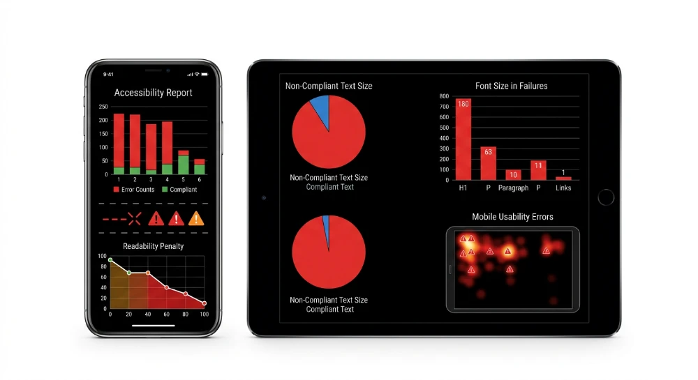
Understanding exactly how failures in font size cause mobile usability readability penalties requires analyzing Google's mobile-first indexing algorithms. Text rendering directly dictates SERP visibility. When bots crawl a mobile page layout, they evaluate typographic properties mapped against specific viewport parameters. If the text forces a user to pinch-zoom, algorithms flag the rendered nodes. This triggers direct visibility suppression.
The exact failure threshold is strictly mathematical. A computed font size below 12px triggers immediate alerts during the rendering phase. Google Lighthouse evaluates this condition under its SEO Score framework.
At least 60 percent of the textual content on a page must meet or exceed this 12px baseline requirement. Fail this metric, and search algorithms immediately devalue the URL.
The text evaluation process relies on specific technical parameters during the crawl phase:
- Bots load the HTML to compute final rendering styles based on mobile viewport constraints.
- The algorithm scans the rendered page structure to calculate the baseline pixel ratio of all text elements.
- Any font dropping below the 12px computed size minimum threshold fails the usability test.
- Google Lighthouse reflects this structural failure directly in the final SEO Score reduction.
Webmasters track these rendering faults through Google Search Console. Navigate directly to the Mobile Usability Report to find the exact problematic nodes across the domain. The platform generates a specific error string: 'Text too small to read'. This exact alert confirms that mobile bots rejected the typographic scale configuration of the page.
Auditing legibility metrics via Google search console and lighthouse
Extracting the specific HTML nodes responsible for readability penalties requires isolating the diagnostic data within Google Search Console. Navigate through the left sidebar directly to Experience -> Mobile Usability. The exact failure logs sit within this dedicated dashboard.
Select the specific error row to reveal the detailed URL sample list. The platform isolates the exact pages failing the structural validation rules. Extract this data to map the problematic templates across the domain infrastructure.
- Export the affected URL list via API for bulk template analysis.
- Load a failing URL into browser developer tools to inspect the computed layout properties.
- Isolate the specific HTML text nodes falling below the rendering threshold.
Lighthouse scoring guide parameters
Lighthouse automates the font size audit by executing a headless render of the target page. The engine parses the HTML tree and computes the final rendered size of every text node based on mobile screen constraints. The Lighthouse Scoring Guide applies a strict mathematical condition to these layout calculations.
| Lighthouse Audit Parameter | Requirement Threshold | SEO Score Impact |
|---|---|---|
| Legible Text Ratio | 60% of page text must maintain a minimum computed size of 12px | Binary Pass/Fail |
| Text Node Evaluation | Applies to all visible text nodes excluding hidden structural elements | Triggers overall score reduction |
A page fails the audit the moment the compliant text ratio drops to 59.9 percent or lower. The tool immediately flags the layout and deducts points from the performance metric. There is no partial credit in this evaluation phase.
Readability penalties trigger severe consequences within mobile-first indexing protocols. Search engine crawlers use the mobile render as the primary canonical version for all ranking calculations. When the algorithm detects extensive legibility failures, it categorizes the layout as structurally hostile to users. This classification acts as an active negative ranking factor.
Pages failing the font size audit face rapid algorithmic demotion. The engine suppresses the affected URLs, leading to an immediate drop in SERP visibility. Recovering lost traffic requires deploying layout fixes to production and requesting validation through the reporting interface.
Run a deep technical crawl to identify 4xx errors, missing meta tags, and indexation blockers.
Viewport configuration errors and DOM rendering triggers
Mobile browsers require explicit layout instructions to process document rendering trees correctly. Without proper viewport signaling, the browser engine defaults to desktop assumptions. This architectural flaw cascades down the DOM structure, immediately breaking text legibility regardless of downstream style rules.
The rendering pipeline relies on a specific HTML declaration in the document head to map software pixels to physical device screens. You must deploy this exact meta tag:
<meta name="viewport" content="width=device-width, initial-scale=1">This directive synchronizes the layout width with the device hardware. The width=device-width instruction maps the rendering surface to the exact dimensions of the screen. The initial-scale=1 parameter instructs the rendering engine to establish a baseline 1:1 ratio, preventing artificial zooming on load. Omitting this single line of HTML guarantees immediate rendering failures across all mobile environments.
The Auto-Zoom phenomenon
When iOS and Android devices parse a document lacking a viewport tag, they execute an automated fallback mechanism. The browser assumes it is rendering a legacy desktop layout rather than a mobile-optimized interface. It constructs a synthetic viewport canvas, typically locking the layout at 980 pixels wide. The engine then artificially compresses this entire DOM tree to fit the narrow mobile screen.
This behavior is known as the Auto-Zoom Phenomenon. A paragraph configured with acceptable typography specifications will be microscopically scaled down. Text nodes shrink to unreadable dimensions as the browser force-fits the 980-pixel virtual canvas into a 320-pixel physical display. The layout appears structurally intact, but the actual rendered text size plummets. This triggers rapid algorithmic demotion from search engines analyzing the viewport output.
The browser engine handles document scaling based on three distinct configuration states.
| Configuration State | Engine Behavior | Rendering Outcome |
|---|---|---|
| Missing Viewport Tag | Defaults to 980px virtual canvas | Triggers Auto-Zoom Phenomenon |
| Hardcoded Width (width=320) | Forces a rigid layout boundary | Creates severe device fragmentation |
| Device Width (width=device-width) | Maps to the physical hardware screen | Renders text nodes correctly without compression |
Mobile-Responsive breakpoints and reflow issues
Viewport configuration failures directly sabotage responsive design logic. Media queries rely on the viewport boundary to trigger specific layout adaptations. If the viewport meta tag is missing, mobile-responsive breakpoints fail to execute. The browser never receives the signal that the screen width has crossed a critical threshold, leaving the desktop layout permanently active.
This breakdown in the rendering pipeline causes aggressive DOM structural faults, manifesting in severe readability errors.
- Text Clipping: Fixed-width parent containers fail to collapse into single-column layouts. Text nodes bleed outside the visible screen edge, forcing users to scroll horizontally to read a single sentence.
- Layout Reflow Failures: Child elements miscalculate their boundaries relative to the viewport. The browser engine forces erratic text wrapping, resulting in jagged, fragmented paragraphs that destroy the reading experience.
- Container Overflow: Floating elements and adjacent DOM nodes overlap text blocks when the document attempts to adjust without proper breakpoint constraints.
Fixing layout legibility requires stabilizing these structural boundaries first. You cannot resolve readability penalties if the document HTML fails to establish the baseline rendering constraints for the browser engine.
Replacing absolute pixels with scalable CSS architecture
Hardcoded pixels form the root cause of systemic text rendering failures across varying device constraints. An absolute CSS unit operates blind to the viewport environment. It forces the browser engine to render typography at a static physical dimension, regardless of device density or user preferences.
Pixels map to rigid screen coordinates rather than visual proportionality.
When an engineer assigns a static 14px declaration to a paragraph block, that text node remains locked. A user accessing the HTML document via a high-density mobile screen receives a compacted visual element. The browser engine cannot override this absolute declaration during the reflow process, triggering immediate legibility flags in the audit pipeline. Overriding these static declarations requires migrating the entire typographic system to scalable units.
Migrating to relative CSS units
Transitioning to a scalable architecture mandates abandoning absolute metrics entirely. You must construct the typographic scale using relative units that calculate rendered dimensions dynamically based on context.
The standard protocol involves three distinct unit types:
- Percentages (%): Bind the baseline document text size directly to the default parameters of the user's browser engine.
- Root ems (rem): Calculate child node dimensions strictly against the root HTML element, bypassing parent container inheritance faults.
- Ems (em): Multiply the inherited size of the immediate parent node, useful for localized component scaling but prone to compounding mathematical errors in deep DOM trees.
Deploying root ems establishes predictability across complex layouts. A 1rem declaration tells the browser engine to match the baseline size established at the document root perfectly.
Baseline CSS configuration parameters
Establishing a responsive baseline starts at the document root level. The standard browser default sits at 16px. Setting the root font size to 100% preserves this native rendering behavior while ensuring the layout scales if the user alters device-level text preferences.
html {
  font-size: 100%;
}
body {
  font-size: 1rem;
}
This ruleset establishes a clean baseline multiplier. If the browser default is 16px, 1rem equals exactly 16px. Industry baseline standards dictate a minimum computed text dimension between 16px and 18px for primary body copy on mobile configurations.
Using 1rem as the baseline guarantees the text scales symmetrically. The browser engine handles the mathematical conversion dynamically across all sub-nodes.
| CSS Unit Type | Calculation Source | Compounding Risk | Responsive Behavior |
|---|---|---|---|
| Pixel (px) | Absolute hardware coordinates | None | Static text locking |
| Percentage (%) | Browser default settings | High in nested containers | Dynamic baseline scaling |
| Root em (rem) | Root document node only | Zero compounding | Predictable global scaling |
| Em (em) | Immediate parent element | High in deep structures | Localized component scaling |
Replacing legacy pixel declarations with this rem-based architecture resolves the core rendering lock. The browser regains the computational authority to scale document text nodes organically according to the viewport constraints without triggering overlapping elements or horizontal scroll requirements.
SEO structure and reciprocal link analyzer
Detect orphan pages, deep click depths, and toxic reciprocal links built by careless agencies.
Deploying fluid typography with CSS comparison functions
Transitioning to root-relative sizing establishes a solid structural foundation. Fluid typography eliminates the rigid stepping effect caused by standard media query breakpoints. Text dimensions adapt dynamically across infinite viewport configurations.
The mechanics rely on specific viewport dimensions. Viewport width (vw) represents one percent of the horizontal screen estate. Viewport height (vh) represents one percent of the vertical space. Tying text directly to these units forces the DOM to redraw text size in real-time as the screen resizes or changes orientation.
Relying exclusively on pure vw units introduces severe rendering risks. A CSS rule setting body copy to 2vw computes to 24px on a 1200px desktop monitor. That exact same rule calculates to 6.4px on a 320px mobile screen. This extreme downscaling triggers immediate legibility failures.
Engineering a stable fluid text layer mandates the implementation of CSS comparison functions. These native CSS capabilities execute mathematical logic directly in the browser engine, controlling the scaling curve.
- max(): Defines a strict baseline floor, preventing text from shrinking below a readable dimension regardless of extreme mobile viewport constraints.
- calc(): Executes mathematical operations between dissimilar units, often combining a static rem base with a dynamic vw modifier to engineer custom growth rates.
- clamp(): Establishes a complete responsive boundaries matrix with absolute minimum, preferred fluid, and absolute maximum scaling limits.
Implementing the clamp() function
The clamp() function resolves the volatility of raw viewport units. It requires three distinct arguments: the minimum rendering threshold, the ideal responsive calculation, and the maximum ceiling limit.
:root {
  --fluid-body: clamp(1rem, 0.8rem + 1vw, 1.25rem);
}
p {
  font-size: var(--fluid-body);
}
This code structure locks the baseline rendering at 1rem. The text will never render below that floor. The middle argument dictates the fluid scaling factor. The final argument caps the upward scaling limit at 1.25rem to maintain layout integrity on ultrawide monitors.
Managing typography scale control across complex enterprise applications requires integrating clamp() with CSS variables and media queries. Hardcoding clamp values directly into individual component classes creates an unmaintainable CSS architecture. Centralizing these rules creates a more performant execution strategy.
| Architecture Method | Execution Strategy | Impact on DOM Rendering |
|---|---|---|
| CSS Variables | Declare clamp() rules within the :root pseudo-class | Centralizes calculation logic and reduces CSS payload overhead |
| Media Queries | Redefine variable boundaries at macro-level breakpoints | Prevents scaling exhaustion on extreme viewport dimensions |
A hybrid approach yields the highest performance. Define fluid variables at the root level. When the viewport crosses a critical breakpoint where the initial clamp() calculation maxes out, inject a new CSS variable set via media query with updated scaling parameters.
:root {
  --text-primary: clamp(1rem, 0.75rem + 1.25vw, 1.5rem);
}
@media (min-width: 1200px) {
  :root {
    --text-primary: clamp(1.2rem, 1rem + 1vw, 2rem);
  }
}
This methodology ensures text scales smoothly between specific device thresholds. The browser engine processes these variable shifts instantaneously without main thread blocking. The resulting DOM paints deliver precise typographic adaptation without triggering cumulative layout shifts.
WCAG 1.4.4 compliance and user experience behavioral metrics
Search engine legibility evaluations do not exist in a vacuum. Technical SEO audits directly mirror baseline accessibility protocols. When rendering engines flag sizing anomalies, they enforce structural principles rooted in WCAG standards.
Failing these audits degrades search visibility. It destroys human usability simultaneously.
The 200% zoom mandate
WCAG 1.4.4 sets a rigid compliance threshold for typography. Users must be able to scale text up to 200% without relying on assistive technology. This scaling must execute flawlessly without introducing horizontal scrolling.
If a CSS container clips text or forces a horizontal swipe after a 200% magnification trigger, the architecture fails. This specific accessibility standard tests the durability of the layout against aggressive, user-initiated DOM reflows. Hardcoded pixel boundaries shatter under this stress test. Fluid relative units absorb the magnification.
Accessibility failures trigger immediate UX friction. This friction generates negative behavioral data.
Pinch-Zoom necessity and behavioral vectors
Forcing a visitor to manually pinch-zoom constitutes a critical UI failure. The mechanical effort required to read unscaled text sabotages session quality immediately. Search algorithms process these negative user interaction patterns during ranking evaluations. Specific behavioral vectors collapse when pinch-zoom actions become mandatory.
- Bounce rate escalation: Visitors arriving from a SERP expect immediate content accessibility. Confronted with unreadable text requiring manual viewport adjustment, users abandon the session and trigger a negative interaction signal.
- Dwell time degradation: Continuous horizontal panning increases cognitive and physical load. Readers exhaust quickly. This physical friction slashes the total duration of the session before exit.
Analytics platforms track the direct correlation between UI friction triggers and KPI deterioration.
| Friction Trigger | UX Impact | Behavioral SEO Penalty |
|---|---|---|
| Microscopic text rendering | Mandatory pinch-zoom interaction | Immediate bounce rate escalation |
| Horizontal scroll requirement | Continuous manual panning | Severe dwell time degradation |
| Reflow failure on 200% magnification | Content clipping and overlap | Task abandonment and reduced internal CTR |
These interaction metrics serve as a proxy for layout quality. High bounce rates combined with low dwell times signal to ranking algorithms that the destination page fails to satisfy query intent. Resolving WCAG 1.4.4 compliance directly stabilizes these behavioral vectors.
Visualize anchor distribution to prevent algorithmic penalties caused by agency over-optimization.
Restructuring typographic hierarchy and spacing parameters
Vertical rhythm anchors the mobile reading experience. Adjusting base text scales solves only a fraction of the layout equation. The spatial relationships between typographic elements demand precise CSS configurations to maintain structural legibility. Heading structures dictate document semantics and visual parsing.
A flat typographic scale causes cognitive overload. Rendering engines rely on explicit visual hierarchy to validate HTML semantics during mobile processing. When H2 and H3 nodes render at identical computed sizes on small viewports, the layout suffers from structural ambiguity.
Visual hierarchy failures directly trigger Lighthouse readability penalties. The audit engine maps the physical proximity of text blocks and their relative scale. If margin and padding values fail to separate discrete content sections, the algorithm registers a structural collision. Text blocks merge into impenetrable clusters. This spatial crowding fails the tap target sizing checks and degrades the overall layout score.
CSS implementation for H1-H6 nodes
Establishing a mathematical scale ensures headers resize proportionally across viewports without breaking containment boundaries. The typographic scale must clearly differentiate each header level while respecting the strict physical limitations of narrow mobile screens.
h1 { font-size: 2.25rem; }
h2 { font-size: 1.75rem; }
h3 { font-size: 1.5rem; }
h4 { font-size: 1.25rem; }
h5 { font-size: 1.125rem; }
h6 { font-size: 1rem; }
Applying this structure guarantees that an H1 remains visually distinct from an H2, even when scaled down by mobile-specific media queries. Scaling typography requires strict management of the surrounding whitespace to prevent element overlap.
Structural legibility and spacing ratios
Tight spacing ruins legibility faster than microscopic font sizes. Three CSS properties control the physical breathing room required for seamless mobile reading.
- Line-height: Paragraph text requires a line-height ratio of exactly 1.5. This prevents ascenders and descenders on consecutive lines from overlapping. Headers demand a tighter ratio, typically 1.1 to 1.2, to maintain visual cohesion when a title breaks across multiple lines.
- Margin: Vertical margins establish macro-typography. Apply margins to the bottom of elements rather than top and bottom simultaneously to prevent margin collapse anomalies in the rendering sequence.
- Padding: Internal spacing dictates micro-typography. Padding ensures text does not sit flush against container edges or device bezels, which is a common trigger for tap target overlap penalties.
| CSS Property | Target Element | Optimal Baseline Value | Readability Impact |
|---|---|---|---|
| line-height | p, li | 1.5 | Prevents inter-line text overlapping |
| line-height | h1, h2, h3 | 1.1 - 1.2 | Maintains multi-line header cohesion |
| margin-bottom | p, blockquote | 1.5rem | Separates paragraphs visually |
| padding | section, article | 1rem | Protects text from edge clipping |
Debugging reflow anomalies in complex DOM nesting
Deeply nested DOM structures introduce severe reflow vulnerabilities. When relative units dictate the spacing of parent and child nodes simultaneously, calculated values compound. An element nested four levels deep using relative margins can suddenly push content beyond the viewport bounds. This triggers immediate horizontal layout shifts and ruins the mobile session.
Debugging these reflow issues requires isolating the inheritance chain.
Inspect the Computed tab in browser developer tools to trace the exact inheritance path of the cascaded values. Developers frequently make the error of applying em units for padding inside containers that also define explicit font sizes. This causes exponential scaling. Replace inherited container margins with root-relative units to immediately halt exponential scaling across nested nodes. Apply universal outline borders to core layout containers via CSS to visualize bounding box collisions. This diagnostic technique exposes the precise node forcing the overflow.
div, section, article, p {
  outline: 1px solid red;
}
Mapping the physical boundaries of every DOM element immediately reveals where margin collapse fails or where padding pushes text off-screen. Once the offending container is isolated, override the compounded relative unit with a strict root-relative value to stabilize the document flow.