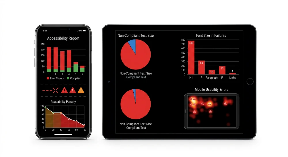
Understanding why elements that are clickable and too close trigger mobile UX signals requires analyzing the exact metrics of the Page Experience update. Google Search Console flags these proximity errors directly in the Mobile Usability Report. The penalty is strict. Sites failing to provide adequate spacing face algorithmic devaluation under Mobile-First Indexing parameters.
The standard Touch Target Size threshold dictates a minimum rendered area of 48 by 48 CSS pixels. Missing the Viewport Tag forces mobile browsers to render desktop layouts at a scaled-down resolution. This creates immediate spacing failures. When buttons overlap in the HTML structure, automated crawlers log a layout violation.
Evaluating touch area compliance requires rendering the URL through Chrome DevTools or Google Lighthouse. These environments simulate mobile viewports to calculate exact pixel distances between interactive elements. Insufficient CSS Padding converts a minor layout overlap into a negative Ranking Factor. Correcting this configuration recovers lost SERP positions and improves baseline SEO metrics. A high CTR cannot save a page if the underlying layout fails automated mobile validation.
Algorithmic impact of target spacing on Mobile-First indexing
The layout proximity of interactive nodes dictates algorithmic trust under Mobile-First Indexing. When automated crawlers detect structural overlaps, the URL fails the mobile-friendliness baseline. This failure directly modifies the Ranking Factor assigned to the page. Search engines do not evaluate content quality if the underlying HTML prevents seamless user interaction. Poor spacing creates a rigid block to achieving full compliance with the Page Experience update.
Persistent layout violations trigger severe consequences.
Once an error registers in the Mobile Usability Report, the algorithmic devaluation process begins. The system assumes a degraded user journey. Search Engine Rankings drop specifically for mobile queries, severing visibility for the vast majority of search volume. A high-performing URL falls out of the primary SERP entirely if interactive elements remain merged in the mobile viewport.
Correlating layout failures with traffic decay
Identifying the exact penalty requires mapping technical flags to performance data. Webmasters must utilize GSC Insights to track the timeline of the devaluation. When Google Search Console flags a URL for spacing issues, the impact on visibility is rarely subtle.
- Filter performance data strictly by mobile devices to isolate the impact of the error.
- Compare the error detection date against sudden organic traffic shifts.
- Monitor exact keyword positions to calculate SERP volatility metrics across the affected URL cluster.
- Extract the affected page list to prioritize structural HTML remediation.
The correlation between layout validation failures and immediate traffic decay is measurable. Spacing errors inject instability into the site's overall SEO performance. Unstable layouts generate unstable rankings.
| Proximity State | Crawler Interpretation | Algorithmic Consequence |
|---|---|---|
| Persistent Overlap | Failed mobile-friendliness check | Severe algorithmic devaluation and loss of mobile Search Engine Rankings. |
| Intermittent Spacing | Unstable rendering execution | Elevated SERP volatility metrics and unpredictable organic traffic shifts. |
| Validated Separation | Compliant Page Experience update signal | Stabilization of Ranking Factor and sustained CTR potential. |
Remediation is the only method to recover compromised Search Engine Rankings. Algorithms demand absolute structural clarity. Layout adjustments restore compliance, signaling to the crawler that the URL is safe for mobile consumption.
Run a deep technical crawl to identify 4xx errors, missing meta tags, and indexation blockers.
Standardized touch target specifications and accessibility thresholds
Interface components require strict mathematical dimensions to pass automated audits and user interaction thresholds. The Web Content Accessibility Guidelines establish the baseline for digital compliance. Failing to meet these structural rules triggers immediate validation flags within auditing environments.
The WCAG Guidelines define explicit hit area requirements through the target-size metric. Success Criterion 2.5.5 mandates a minimum physical execution area of 44x44 pixels. This enhanced standard guarantees element isolation and prevents execution overlap. Success Criterion 2.5.8 offers a lower minimum threshold for dense layouts. Optimizing for the higher benchmark eliminates edge-case interaction failures.
Platform-specific design systems enforce their own distinct scaling logic. Apple’s Human Interface Guidelines dictate specific spatial dimensions for the iOS ecosystem. The absolute minimum baseline is 44x44 points. Interface designers frequently scale these targets to 40x40pt, 44x44pt, or 48x48pt depending on the hierarchical importance of the navigation element. A tap target mapped to exactly 44x44 pixels ensures complete alignment with this framework.
Android/Material guidance requires slightly larger spatial allocations. Material Design guidelines dictate that interactive elements must measure at least 48x48dp. This specific unit refers to 48x48 density-independent pixels. On baseline displays, this requirement translates directly to 48px or an exact block of 48x48 pixels.
Hardware fragmentation renders physical screen pixels useless for standardized layout rules. High-density screens pack more physical pixels into the same spatial footprint. Device-Independent Pixels solve this hardware discrepancy.
Developers rely on DIP to decouple layout logic from hardware resolution. Scaling depends entirely on accurate DPI calculations. Layout engines multiply the base logical units by the device pixel ratio.
| Standard Framework | Measurement Unit | Minimum Threshold |
|---|---|---|
| Web Content Accessibility Guidelines | CSS Pixels | 44x44 pixels |
| Apple’s Human Interface Guidelines | Points | 44x44 points |
| Material Design guidelines | Density-Independent Pixels | 48x48dp |
Audit systems extract these precise mathematical values during rendering. They map the DOM node coordinates and evaluate the spacing geometry before calculating a pass or fail grade.
- Compare layout dimension values directly against Success Criterion 2.5.5 requirements.
- Validate element scaling behavior across multiple DPI configurations.
- Ensure base hit areas default to at least 48x48 density-independent pixels in Material environments.
Target spacing compliance relies entirely on these rigid specifications. Search algorithms do not guess user intent. They calculate exact geometry.
Interaction degradation metrics and coarse pointer mechanics
Search algorithms evaluate mathematical geometry, but humans interact through physical hardware. The primary failure point in mobile navigation stems from the physical discrepancy between a precise digital coordinate and the blunt surface area of human touch. Engineers classify this inherent hardware limitation as the Coarse Input Method. Standard touch devices lack the pixel-perfect targeting capabilities of a desktop mouse cursor. This biological reality inevitably produces fat-finger errors whenever interactive elements cluster too tightly on the rendered axis.
Browsers provide specific environmental queries to detect physical hardware capabilities. Developers execute conditional layout shifts using the
@media (pointer: coarse)
rule. This evaluates whether the primary input mechanism lacks accuracy. Layout engines conditionally scale interface components based entirely on the presence of a coarse pointer. It bridges the structural gap between high-resolution displays and low-resolution human inputs.
Interaction design relies on established mathematical models to predict user friction. Fitts Law dictates that the time required to move to a target is a function of the ratio between the distance to the target and the width of the target itself. Small, densely packed elements drastically increase cognitive load and physically slow down navigation sequences. The rendering engine sees a perfect grid. The user experiences a physical barrier. This disconnect forces View-Tap Asymmetry, a state where the visual representation of an active area fails to align with its physical execution boundaries.
User session logs expose the exact micro-moments when physical pointers fail against rigid screen layouts. Tracking systems categorize these interaction failures to measure interface decay.
- Mistaps occur when the physical input coordinates overlap multiple adjacent active areas simultaneously.
- Accidental taps trigger unwanted state changes because the visual hit area provides zero physical margin for error.
- Ghost taps register touch coordinates just outside the active boundary, causing silent interaction failures.
Analytics platforms record the behavioral fallout of poor input tolerance. Unusable interfaces generate highly specific negative signals that impact session quality scoring.
| Degradation Metric | Behavioral Trigger | Session Impact |
|---|---|---|
| Rage Taps | Repeated physical inputs on an unresponsive hit area | High friction, immediate bounce risk |
| Dead Clicks | Input coordinates landing entirely between clustered nodes | Task abandonment and session stalling |
| Misdirection | Activating the wrong adjacent node due to tight clustering | Corrupted user journey flow |
Accommodating physical interaction limitations pushes beyond baseline usability directly into strict inclusive design parameters. Aging populations and users with degraded motor skills require significantly larger targeting variables to complete standard navigation sequences. Tremors or restricted mobility compound the baseline inaccuracy of any coarse input device. Search systems prioritize layouts that maintain high physical tolerance thresholds across all demographic subsets. Every interactive component must assume a worst-case scenario for physical input precision.
SEO structure and reciprocal link analyzer
Detect orphan pages, deep click depths, and toxic reciprocal links built by careless agencies.
Viewport rendering architecture and layout scaling configurations
Browsers require explicit instructions to construct a mobile-optimized coordinate system. The engine relies entirely on the Meta Viewport declaration to map logical dimensions to physical hardware. Without this parameter, mobile browsers automatically apply default desktop layout rendering parameters. The rendering engine generates the page at a typical 980px desktop width and forcefully scales it down to fit the physical glass. This aggressive viewport compression shrinks interface elements far below acceptable interaction thresholds.
A missing Viewport Tag guarantees immediate architectural failure during layout execution.
DOM rendering depends on this baseline geometry to calculate unit values accurately. Setting the Viewport Width to device-width instructs the browser engine to match the screen's width in device-independent pixels. This critical alignment ensures that one CSS px maintains a consistent, predictable physical size across wildly different hardware densities. When a meta viewport tag correctly dictates these rules, the layout engine scales adjacent components without distorting their spatial relationships.
Critical execution directives
The browser's rendering pipeline interprets specific viewport properties to control the initial paint and zoom limits. Incorrect configurations immediately cause element clustering and grid distortion.
- width=device-width overrides the legacy desktop canvas width, forcing the DOM to inherit the active hardware dimensions.
- initial-scale=1.0 establishes the exact baseline zoom level the moment DOM rendering completes its first pass.
- maximum-scale=1.0 restricts the user from magnifying the layout, which becomes a critical usability failure if the baseline CSS px values dictate undersized navigation nodes.
- user-scalable=no completely locks the rendering architecture, destroying the user's only physical fallback for navigating cramped target spacing.
Static dimensional constraints create severe rendering conflicts. Developers often inject a hardcoded min-width or min-height into container elements. These rigid CSS rules directly oppose fluid viewport scaling operations. If a structural wrapper forces a 600px min-width on a 360px physical screen, the browser must either trigger horizontal overflow or forcefully shrink the internal layout to prevent breaking the DOM. Both outcomes completely corrupt the spatial relationship between interactive nodes.
| Configuration State | DOM Rendering Outcome | Layout Scaling Impact |
|---|---|---|
| Missing Viewport Declaration | Fallback to 980px width, aggressively scaled down | Massive hit area compression, text requires pinch-to-zoom, interaction clusters fail |
| Hardcoded Viewport Width (e.g., width=500) | Fixed canvas generated regardless of hardware | Severe horizontal scrolling on narrow devices, layout breaks on orientation shift |
| width=device-width, initial-scale=1 | 1:1 mapping to hardware logic | Fluid layout scales proportionally, preserving intended CSS spacing geometry |
Search algorithms do not evaluate pages using physical hardware. Crawlers rely entirely on headless mobile device emulation during the rendering phase. When the bot requests a URL, it simulates specific hardware dimensions to process the CSS and execute JavaScript. If the viewport directives are missing, contradictory, or overridden by rigid internal containers, the emulation builds a corrupted render tree. The specific layout constraints processed during this mobile device emulation dictate the exact element coordinates passed back to the indexing systems.
Every pixel of separation relies on the viewport coordinate system functioning flawlessly.
Diagnostic infrastructure: Extracting target area metrics via developer tools
Validating the spatial coordinate system requires node-level extraction. You must inspect the final rendered output directly. Browser Developer Tools expose the exact pixel dimensions calculated by the rendering engine. Relying on source files is a mistake. Cascading rules heavily alter base dimensions before the final paint cycle executes.
Numbers dictate compliance. Visual estimation fails.
To extract accurate metrics, activate the Mobile/Responsive Web Design Tester within Chrome DevTools. This module forces the browser to apply mobile user agent strings and execute viewport constraints natively. Select a specific mobile profile to simulate the constrained rendering environment that headless bots process during indexing.
Isolating the spatial footprint involves specific extraction workflows.
| Diagnostic Interface | Data Extracted | Application in Technical Audit |
|---|---|---|
| Inspect element (DOM Tree) | Raw HTML structure and node hierarchy | Identify nested containers artificially constraining target scalability |
| Computed Panel | computed value in CSS px | Verify the exact numerical footprint of the interaction node after all overrides |
| Mobile/Responsive Web Design Tester | Simulated mobile viewport rendering | Replicate the precise layout shifts that trigger proximity warnings in indexing |
Trigger the Inspect element command on a suspected failing node. Navigate immediately to the Computed panel in the sidebar. This interface strips away the cascaded code and reveals the final computed value for height and width properties. The output displayed here represents the absolute truth of what the rendering engine passes to the interaction layer.
Geometry parsing and coordinate validation
The layout engine maps interaction zones through bounding rectangle analysis. This algorithmic process generates an invisible geometric box around the node, establishing exact spatial coordinates on the X and Y axes. The resulting Computed Area represents the physical space the browser allocates for touch registration.
If the bounding rectangle of one node lacks sufficient coordinate clearance from an adjacent node, the interaction cluster is flagged. The metrics extracted from the Computed panel allow engineers to reverse-engineer these exact coordinate collisions.
Automating target diagnostics with lighthouse
Manual DOM traversal scales poorly across complex URL clusters. Google Lighthouse automates bounding rectangle analysis at the page level. Integrated directly into Chrome DevTools, this audit engine programmatically evaluates every interactive node against the required spatial thresholds.
Executing an accurate diagnostic scan requires a strict workflow.
- Deploy an incognito session to bypass browser extension interference during the render cycle.
- Launch Google Lighthouse and lock the device configuration setting to Mobile.
- Select the SEO category to initiate the interaction parsing sequence.
- Review the diagnostic output for failing coordinate pairs.
The Lighthouse SEO Score directly incorporates these mobile-friendly interaction checks. The engine does not issue partial credits for elements that are almost large enough. The Lighthouse Scoring Guide outlines a strict binary threshold for target clearance. A node either passes the mathematical clearance check or it fails.
Failed nodes degrade the overall score immediately. The audit output provides a localized list of overlapping elements, supplying the exact HTML nodes that require architectural remediation. Engineers utilize this automated output to prioritize which clusters of the DOM require immediate structural intervention to resolve the algorithmic demotion.
Visualize anchor distribution to prevent algorithmic penalties caused by agency over-optimization.
CSS remediation algorithms for hit area expansion
Remediation of failed spatial thresholds requires modifying the coordinate boundaries of interactive nodes. The objective is to expand the mathematical footprint of the element without disrupting the visual rendering of the interface. Engineering teams manipulate the box model properties to increase the Hit areas recognized by the browser rendering engine.
CSS Padding serves as the primary mechanism for increasing tap-targets. Injecting Hit-area padding expands the physical dimensions of the element, extending its active bounding rectangle outward from the content core. Margins strictly push neighboring elements away. While spacing adjustments prevent collision overlaps, they do not resolve insufficient target boundaries. Applying margins creates dead zones between nodes. Applying padding turns those same zones into actionable coordinate space.
Implementing reliable target area execution requires distinct structural approaches based on the HTML node type.
- Anchor Element: Convert inline links to block or inline-block display states to allow vertical padding application without overlapping adjacent text nodes.
- Button Element: Strip native browser styles using appearance resets and apply explicit dimension values alongside uniform padding.
- Input Element: Standardize form fields by declaring explicit rem values for height to maintain proportional scaling across varying viewport dimensions.
Complex UI components often prohibit structural padding due to strict visual design constraints. Injecting spatial CSS directly into the parent node breaks grid alignments. Pseudo-Elements offer a structural bypass for these scenarios. By attaching a before or after pseudo-element to the target node, developers project an invisible interaction layer over the visible component.
The parent node receives relative positioning. The pseudo-element receives absolute positioning with negative positional values. This technique successfully expands the bounding rectangle registered by the rendering engine without shifting the adjacent DOM structure.
Layout architectures require rigid spacing parameters between disparate functional blocks to prevent accidental cross-cluster interactions. A standard architectural pattern enforces 32 pixels spacing between distinct interactive groups, separating primary navigation links from secondary utility menus. This hardcoded separation guarantees that missed taps on an expanded hit area do not accidentally trigger a neighboring function. Utilizing rem units for these separation gaps ensures the layout scales proportionately if the user alters native device font settings.
Different CSS properties carry unique layout shift risks during implementation.
| Remediation Method | Box Model Impact | Layout Shift Risk | Optimal Implementation Scenario |
|---|---|---|---|
| CSS Padding | Expands active bounding rectangle | High | Standard text links, isolated buttons, inline lists |
| Margins | Expands inactive dead spacing | High | Separating distinct interaction clusters and containers |
| Pseudo-Elements | Overlays invisible coordinate grid | Low | Dense navigation bars, icon grids, rigid visual layouts |
Expanding the spatial dimensions resolves coordinate collisions, but event firing latency also dictates interaction quality. Applying Touch-action CSS modifiers optimizes how the browser processes the tap event. Declaring manipulation parameters on the interactive element disables native double-tap-to-zoom logic. The browser bypasses the default tap delay, executing the click immediately upon touch release. This stabilizes target area execution rates and prevents users from registering frustrating ghost taps during fast interactions.